Tuesday, February 24, 2009

Bills new logo? Not so fast.

There were mumblings of rumors that the Buffalo Bills would be getting a new logo to commemorate their 50th season in 2009.  Really, they're getting a new patch on their old uniforms, which is a conglomeration of the throwback and current logos, the Tops Friendly Markets logo, and other commemorative nonsense:

Graphically, it's a C. Some things that bother me:
Where did the tan trim come from?
Why the varying font sizes in the dates and the numbers "5" and "0"?
Why does the red stripe with the dates not align with the logo's red stripe?

Promotionally, though, it's an A+ for Tops.  Tops is a supermarket chain in WNY that as of recently is the K-mart to the Wal Mart of Wegmans.  Anything they can do to hang on at this point is a plus, but a cross promotion with the Bills is huge.

Says Tops prez Frank Curci: Our partnership with the Bills is very important

No, really?

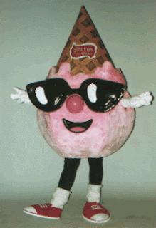
But wait, this isn't a two-dog show!  Labatt Blue and Perry's Ice Cream are in on it too.  Displays for Labatt, the Pilsner of choice of Western New York, will have stations for fans to vote on the all-time Bills team, and Perry's will be introducing a "specially packaged Perry’s Ice Cream that honors the team’s history". I personally can't wait for Orange J. Simpson sorbet...

The assortment of important local companies is cute, but I'm not sure as to the benefit for the team itself.  People that shop at Tops and drink Blue are already season ticket holders (check the parking lot at 8:00 AM on gamedays).  With the overstatement of the century, here's Pete Guelli, Bills senior VP of business ventures:

"We were looking for a local company that could help us create awareness for this milestone and Tops simply touches more people than any company in Buffalo"

I couldn't tell you the number of times I have been touched by Tops.  Actually, I can.  Zero.  Coincidentally, that's also the amount of times I hope to ever be touched by this guy:
Saturday, February 21, 2009

Expect the unexpected


I can't help but crack up at this every time. Lebron sounds so heartfelt when he sings, and I was always wondering how he gets pumped up. Certainly not the whole chalk thing...

Friday, February 6, 2009

Miss this, and it's G-E-I-C-O

Spelling animal names is sooo 2008. Or at least since somebody's boss stole their brilliant idea to to buy the name of the game (traditionally H-O-R-S-E) played during NBA All-Star Weekend. The players will shoot to avoid elimination, which is now spelled G-E-I-C-O.

From USA Today:

Sports are often made for TV. And TV is made for advertisers.

So it shouldn't surprise — especially as all sports are scrambling to find new places to hang "for sale" signs given the current economy — that the NBA's first H-O-R-S-E contest won't use those letters.

As that contest joins dunking and three-point shooting contests as part of TNT's NBA All-Star Weekend coverage, the as-yet unnamed three contestants — who'll be overseen by an NBA ref — will play G-E-I-C-O. As in the insurance company that will be the event's unavoidable sponsor. (Suggestion: The winner then takes on the famous ad lizard to really drive home the brand awareness.)


Yeah, they found a way to take the advertising dog-and-pony show that is the NBA and put a brand name on something else. Brilliant.

Quite frankly, I do follow the NBA and I didn't know there was a HORSE competition (for kids who didn't grow up with a basketball hoop in the driveway, one player makes a shot, usually ridiculously hard, and everyone has to replicate it or else get a letter. Spell the name of the game, and you lose). But hey, the stars will be out in Phoenix to see it, and Geico's obviously getting free PR from bloggers (like the Sporting News, where I heard about this).

Just please, please, please, keep the googly eye money out of it.

Monday, February 2, 2009

Pepsi determines it is a new generation


I can't find the ad they ran during the game tonight. I had seen this one before, and I suppose this is the reasoning behind the new design...a new generation is upon us. It kind of makes sense, new government probably equates to a new generation, especially to those of us who were in elementary school the last time we got a new president. It's kind of subtle, but it makes sense to me now. Whereas Coke is branding themselves as Coca-Cola Classic with the simple red throwback design, Pepsi is evolving with us. You clever dogs, you.

And then there's the overkill on the logo...


Commentary on Super Bowl ads in general to come...

Sunday, February 1, 2009

Rebranding of pepsi? Look how hip it is!

My first attempt at an ad(am)vertising video blog:


Forgot to mention:
Diet Pepsi cans have a different logo with a thinner white stripe in the center of the ball (also note "mtn dew"):

Kind of funny, it's symbolic of you being thinner because you drink diet instead of regular. I wonder if there's also a graphic representation of how aspartame gives you cancer...

Wah wah wah.